
#MapMondays - Social Distancing Scoreboard

Unacast
How is NYC doing with social distancing compared to the rest of the state? What about the country?
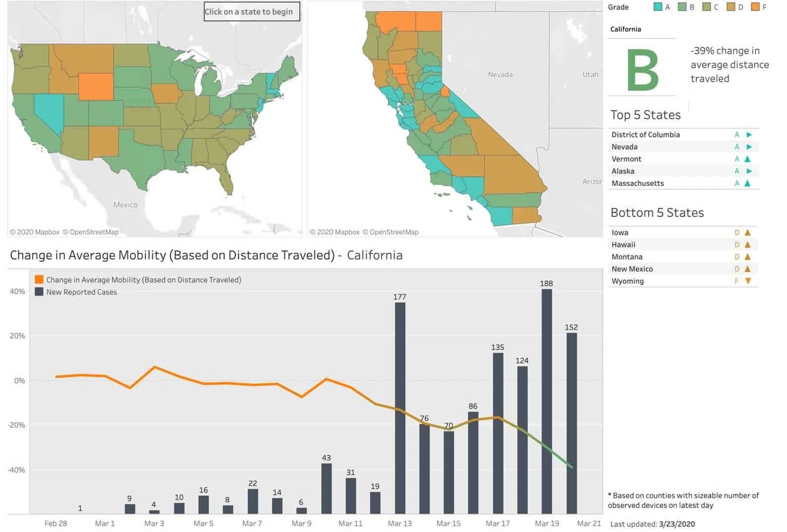
The Social Distancing Scoreboard map compiles cellphone data to track people's change in average distance traveled, a proxy for how well an area is achieving "shelter-in-place." The data is then given a score, A through F, based on the decrease in average distance traveled. This can be viewed by county or state.
According to the World Health Organization and the CDC, social distancing is currently the most effective way to slow the spread of COVID-19.
Unacast
Overall New York State gets an A, with an average decrease of 45%. NYC does even better, with Manhattan leading with a 72% decrease.
Visit our website to learn more about the Social Distancing Scoreboard and access their interactive map.
The data looks at changes in average time spent in and around home, aggregated over time, along with change in the dispersion of activity clusters. The data does not identify individual people, devices, or households, but compiles tens of millions of anonymous mobile phones and their interactions with each other each day -extrapolating the results to the population level.
Change in average distance traveled:
Manhattan: -72%
Brooklyn: -55%
Queens: -58%
Staten Island: -50%
The Bronx: -49%
View the Social Distancing Scoreboard interactive map, here.